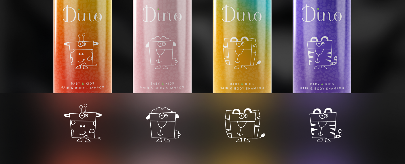
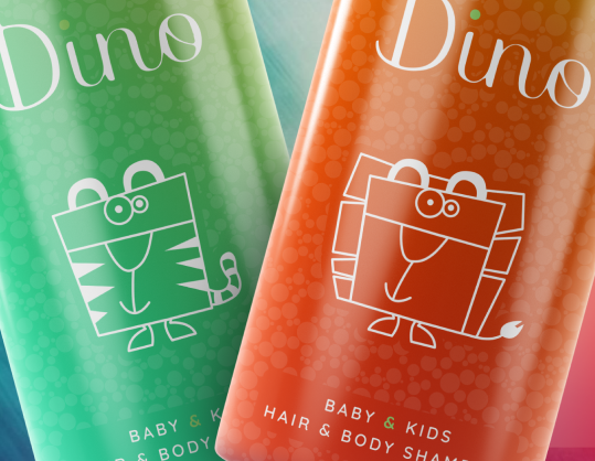
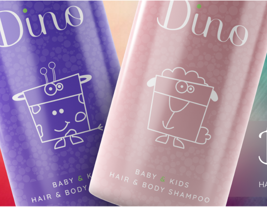
A playful character design for a children’s hair and body shampoo.
The Dino shampoo packaging design is a creative exploration in character design, aimed at engaging young audiences. Featuring a friendly dinosaur mascot, the design combines childlike whimsy with clear product messaging. The goal was to create an approachable, non-threatening character that resonates with both children and parents, making bath time more enjoyable.
Design Notes
The design focuses on a minimalist approach to ensure it remains child-friendly. The dinosaur’s simple, geometric shapes create a sense of fun and innocence. The color palette is bright yet soft, with the primary use of pink to evoke a sense of comfort and warmth. The character’s friendly expression is key to making the product feel approachable, while the overall design maintains a clean and modern aesthetic to appeal to parents.